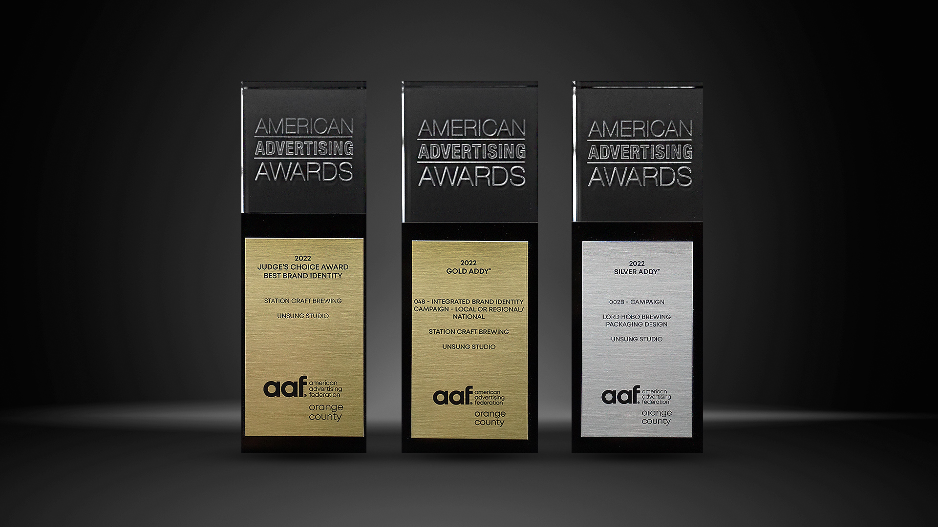
UNSUNG ARTICLES
The Psychology Behind Apartment Branding and Why It Matters
"Whether you’re developing or acquiring a property, branding your apartment can be the difference between closed doors and closed deals."
Connect on Linkedin: WilliamUnsung

Two-thirds of consumers say that shared values are one of their primary reasons for choosing a brand. The true worth of strong branding is the ability to tap into the psychology of the tenant – to create that connection and establishment of shared values from the start. Your apartment's identity, including your logo and branding, is your unique opportunity to set your community apart, communicate your values, and leave a meaningful impression. While there are an endless amount of branding elements to consider, honing in on one is the key. Here are three components to apartment branding and how they persuade a tenants journey.
01. Identity & Voice
The language you use, the logomark of your property, and the photography you tie to your story all play a role in creating an emotional connection to your customer. Take a look at what you want your brand to be or represent. What is your defining factor? Is your property a luxury community? Earth (eco) friendly? Downtown chic? A hidden gem? Consider this alongside the type of customer or tenant you’re trying to attract and let your choice guide the message you share with the market.
Additionally, a thoughtful and on-target tagline can go a long way in establishing your brand identity. The right 3-4 words or short sentence, when paired with your logo, can ground your brand and give potential customers a quick feeling of joy at first glance. The catchier the better!
02. Color Palette
Choosing colors for your property brand is about more than just personal preference or stylistic ideals. It’s important to remember that each color has a meaning all its own, tending to evoke certain feelings and inspire certain actions in tenant. Research the psychology of colors, decide how you want your audience to react to your brand, and then compare the two to ensure that your decisions match up with your goals. The direction you go with will color every interaction between your brand and tenant –– literally and figuratively –– from the first look at your website to signing the lease agreement on the dotted line. Everything in marketing is intentional...and color is no exception.
Quick Guide:
- Earth tones, like darker reds and browns give a homey and comforting feeling
- Greens convey peace and wellness
- Red tones are exciting and inspire action
- Blue indicates calm and trust
- Black and purple convey luxury and elegance

03. Typography
Just like color selection, fonts should visually communicate the personality of your brand. Is your brand trying to be hip and young? Classic and timeless? Sophisticated? Playful? Choose two complementary fonts that can be used across all of your marketing collateral. Within the property’s identity system, you want to strike a balance between readability and individuality. For example, a beautiful sign at your entrance to give tenants a sense of pride in where they reside. The goal is to create an identity that people can connect to, get inspired by, and feel good about coming home to.
At the end of the day, your property is always going to be the star of the show – but you still have to convince people to take notice. Branding an apartment is about connecting with a potential tenant once and sharing with them a tailored experience. When you catch the attention of a customer, it needs to be strong enough to entice them to learn more about the full feature: including the atmosphere you’ve curated, the amenities you offer, and the neighborhood they could call their own.

Let's Talk About Your Property
We provide apartment branding that provides a competitive edge in the crowded market. As property branding experts, we understand the importance of both first impressions and design consistency that stands the test of time.