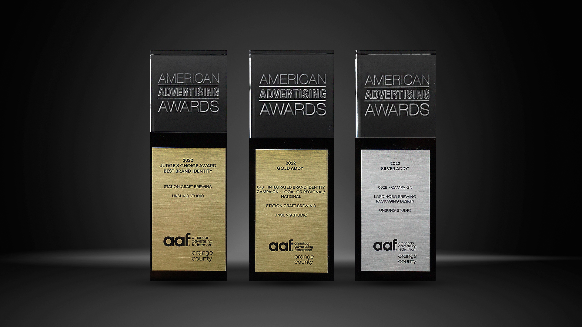
UNSUNG ARTICLES
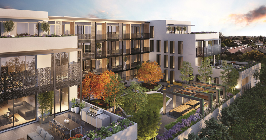
The Three Styles of Multi-Family Development Branding
"Think of property branding as a form of compound interest"
Connect on Linkedin: WilliamUnsung
When developing or acquiring a multi-family property, there’s a lot to consider, from how you’ll attract tenants to how you’ll convince them to stay. But no matter your target audience or end goal, there’s always one to-do that should come before all else: building your brand identity. The look, feel, and tone of your brand will ultimately be what inspires tenants to take interest in your property, and if done correctly, can lead to a competitive edge in the form of strong tenant retention –– also known as brand loyalty. While strategic branding boasts a lot of benefits, one of the greatest it has to offer is the ability to tap into the psychology of the tenant.
Think of property branding as a form of compound interest. First, you create an emotional connection to your brand’s strong design and voice. That foundation influences customer decision making, creating positive energy around your brand. That influence and energy continues to build up to greater success, leading to longer leases and more loyal tenants. Similar to earning interest on interest, the branding decisions you make add up over time: continually leading to more meaningful customer relationships and ROI.
Now that you have a better understanding of the importance of property branding, we want to share with you the three primary styles of multi-family development branding. Once you’ve secured a property and have the basics down (such as a name and a target audience), it’s time to pass the baton to your creative team to let them take it to the finish line. Of course, the more informed you are about the style you’re looking for in your property, the more you’ll be able to inform your creative partners and the quicker you can get to the desired result. Here are the three primary styles of development branding:

01. Typographic Design
Once the name of your property is determined, you can move forward designing its visual identity. Depending on the personality of the property, different type treatments can be deployed. There is a psychology behind the fonts used and how the type is treated – empowering your brand to evoke a certain feeling at just a glance.

02. Feature-Focused (Literal) Design
This style of design is typically deployed if the community has a strong or fun environmental feature that can be emphasized. For example, Oak Tree Community or Spring River Apartments. By nature, humans process visual imagery faster than text alone, which is why so many logos will include some type of symbol along with the brand name. These identities include a logo inspired by their defining feature. The visual element of a logo is often accompanied by a typographical element, but they can also stand alone in collateral design.

03. Numerical-Focused (Address) Design
Often within cities where street numbers are major identifiers, developments will use the address as the name of the property. For example 601 Sunset Drive may be the address of the property, and in turn the property name becomes Six01 or SixHundredOne. This approach works well for cities that have strict exterior signage rules requiring businesses to display the address outside, because this meets that need, while also appealing to tenants in a creative way via visible, expressive signage.

Ready to get started on branding your property?
As Your Creative Partner, we'll get your property looking top-notch to compete in the market in no time!