UNSUNG ARTICLES
How Your Hotel's Website Can Make or Break Your Business
"When you show customers that you’re not just another hotel, you become more recognizable and easy to find in searches, more attractive to prospective guests, and more likely to make an impact in the exact way you had planned."
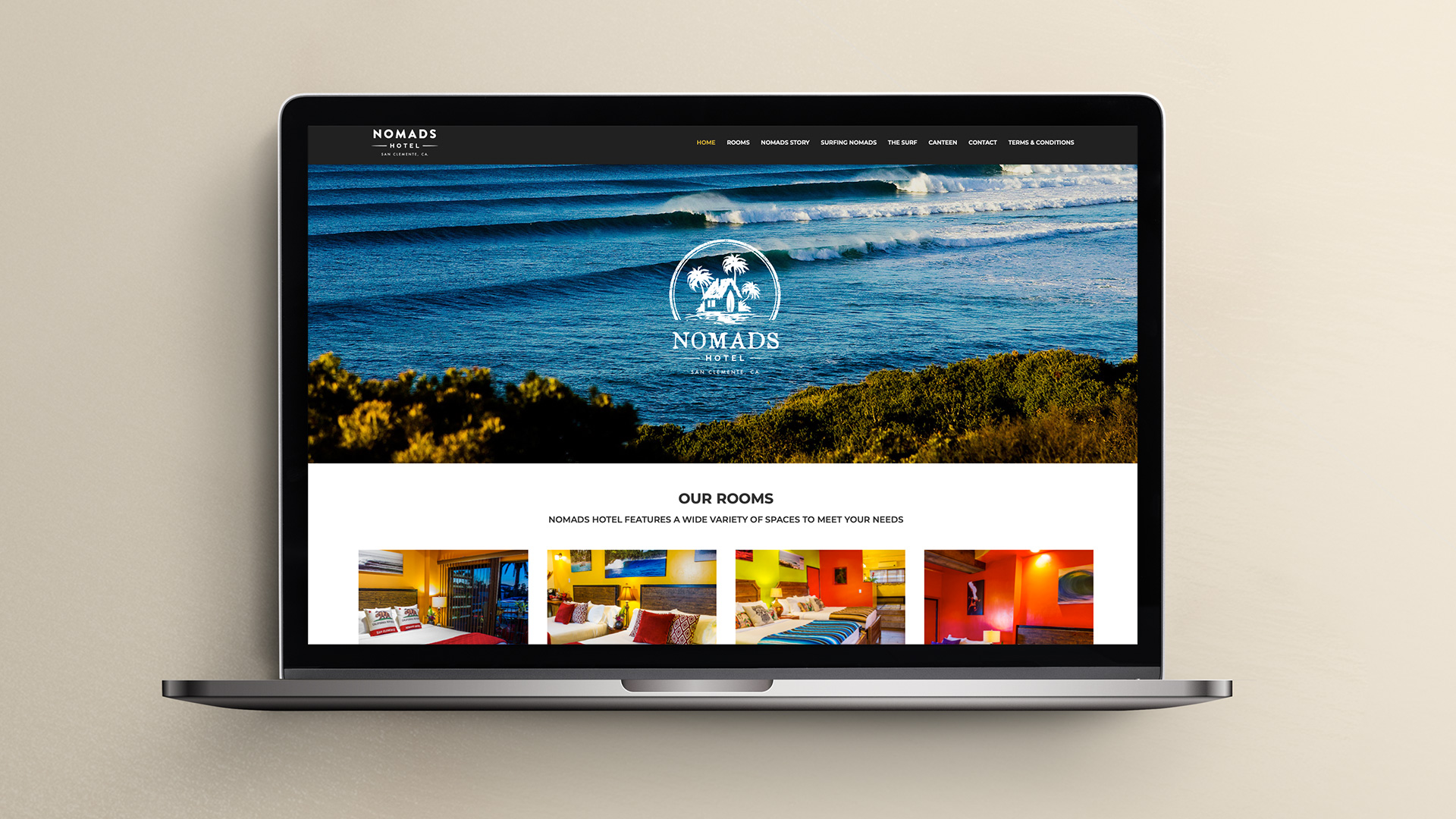
Let's face it. Every business out there today has a website. Some are simple, while others are robust and full of so much information that consumers can get lost on the landing page — never to return again.
The way you differentiate yourself from the noise of websites out there is essential to attracting new customers and getting them to keep coming back.
When you design a website around your brand that shows customers that you’re not just another hotel, you become more recognizable and easy to find in searches, more attractive to prospective guests, and more likely to make an impact in the exact way you had planned.
How a Bad Website Hurts Your Hotel Business
Did you know that 75% of consumers admit that they decide how credible your business is by what your website looks like? On top of that, 79% of shoppers said they wouldn't purchase from a slow-loading website.
With stats like that, you can’t afford to have a bad website. Just think — all those potential bookings lost because your website doesn’t look credible or loads too slow. Don’t let this happen to you. Make sure your website includes these 5 things:
5 Components of a Great Hotel Website
1. Consistent Branding
Does your hotel website contain several conflicting colors or more than 2 fonts? Do you use the same colors and fonts on other marketing and sales materials for your business?
Inconsistent branding leaves your potential customers confused. They won’t easily recognize your hotel brand when seeing it if you don’t use the same colors and fonts on everything your business produces — from business cards, to social media pages, to your website.
2. Visually Pleasing
Websites that are just plain ugly will turn your visitors away every time. No one wants to scroll around on a website that hurts their eyes, is hard to read, or has broken elements littered throughout the site.
If you’re not a professional website designer, then it’s best to use a professionally designed template. That way, you can make minimal changes to get it to match your company’s branding — colors and fonts — and tweak the content to meet your needs without ending up with a poorly designed website. That said, you’re always going to get the most out of your branding and design when you work with a professional agency that specializes in website design.
3. Designed For All Devices
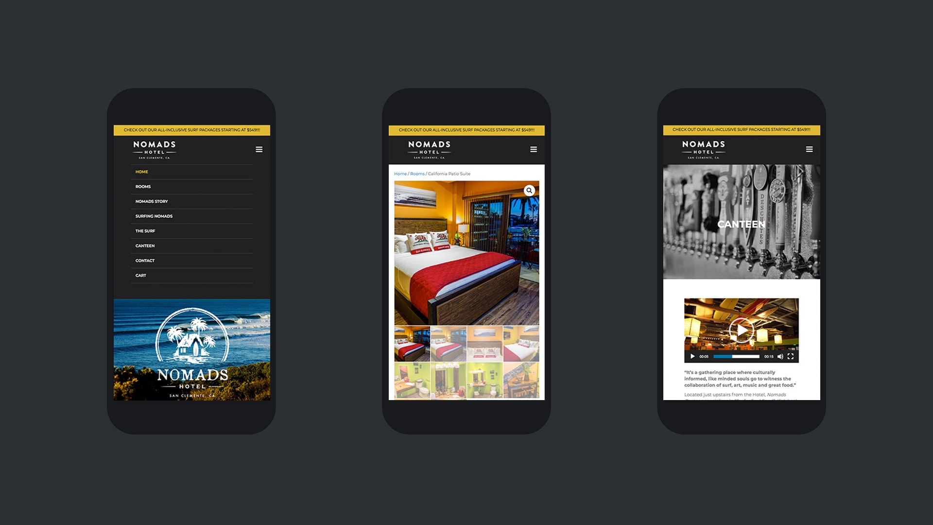
Does your website look just as good on mobile devices as it does on a laptop or desktop? If not, you’re missing out on a lot of potential bookings.
Why? Because in the third quarter of 2020 alone, smartphones generated 50.81% of all global website traffic. That’s a lot of visitors you’re missing out on if they can’t view your website from their mobile device.
Again, if you're not a professional website designer, you can purchase pre-built themes that work on all devices. But, a word of caution when using pre-built themes: they tend to break easily or don’t do exactly what you want a lot of the time.
4. Valuable Content
Not only does your website need to look amazing and work on all devices — it needs to contain valuable content that your visitors will actually get something out of by reading. What is valuable content? Here are a few examples to get your creative juices flowing:
- Interviews from happy guests or employees at your hotel
- Articles about famous guests who’ve stayed in your hotel
- New features you’re unveiling — swimming pool, gym, king size beds in every room, etc.
- Top attractions in the area that your guests would enjoy visiting during their stay
- Upcoming events that would draw guests to your hotel
- A video tour of your hotel with a rundown of all the amenities
- Introduce new employees or celebrate employee achievements or milestones
- Holiday related content
- A list of interesting facts about your city
- A behind the scenes video of your hotel’s kitchen
5. Clear Calls to Action
Does your website clearly tell visitors how to book their stay at your hotel? If not, it should. If it does, do you have clear calls to action sprinkled all throughout your website in the most prominent places?
Visitors landing on your website will scan your site in a z pattern — meaning you need clear calls to action in the top right corner and the middle of the “above the fold” part of your website (aka: the header), and the bottom right corner.
In addition, you’ll need to include calls to action at the bottom of every blog post you publish. These can command your readers to book a free consultation, make a phone call, or even just leave a comment. Increasing engagement and looping them into your ecosystem will help pave the way for future stays.

Let's Get You Standing Out Over The Competition
At Unsung Studio, we understand exactly what your hotel website needs to have and how to give you a competitive edge in the crowded market. We’re creative experts in the vacation and hospitality branding, so we can help you in ways that other creative professionals just can’t.
We understand the importance of a first impression and a strong consistent brand that stands the test of time. We know we’re more than a little biased, however, so don’t just take our word for it.
